
In an email campaign, every single detail such as the layout, content, and visual elements impacts the email performance. The biggest impact is, however, that of the colors used in the email design. Colors can make or break your email design.
Email marketers have been using colors to make their campaigns more accessible and visually appealing. But choosing the right colors and using them in the right way can help email marketers in creating more effective emails. To begin with the creation of a winning design, you can download Pardot templates or Salesforce email templates. Read on to find out how to use the right colors in emails.
Use your Brand Colors
Before searching for the best colors to include in your email to enhance its design, consider using your brand colors. Whether you are designing emails or landing pages, it is important to mirror your brand in the design and make it recognizable for your users. Reinforce your branding and bring consistency in the style and tone in all your emails. Even if you try something new, make sure it is in line with your branding guidelines. This will create trust among your users and improve the chances of your emails getting opened and read.
Here’s an example from Starbucks. Starbucks keeps its branding consistent throughout its marketing strategies, which has made it one of the most recognizable brands in the world. Its imagery, language, and especially colors match the same tone and style across all its branding collateral. As shown in the below email, using the same tint and brand color in all the emails have helped them in improving branding and delivering a lasting message to their subscribers.
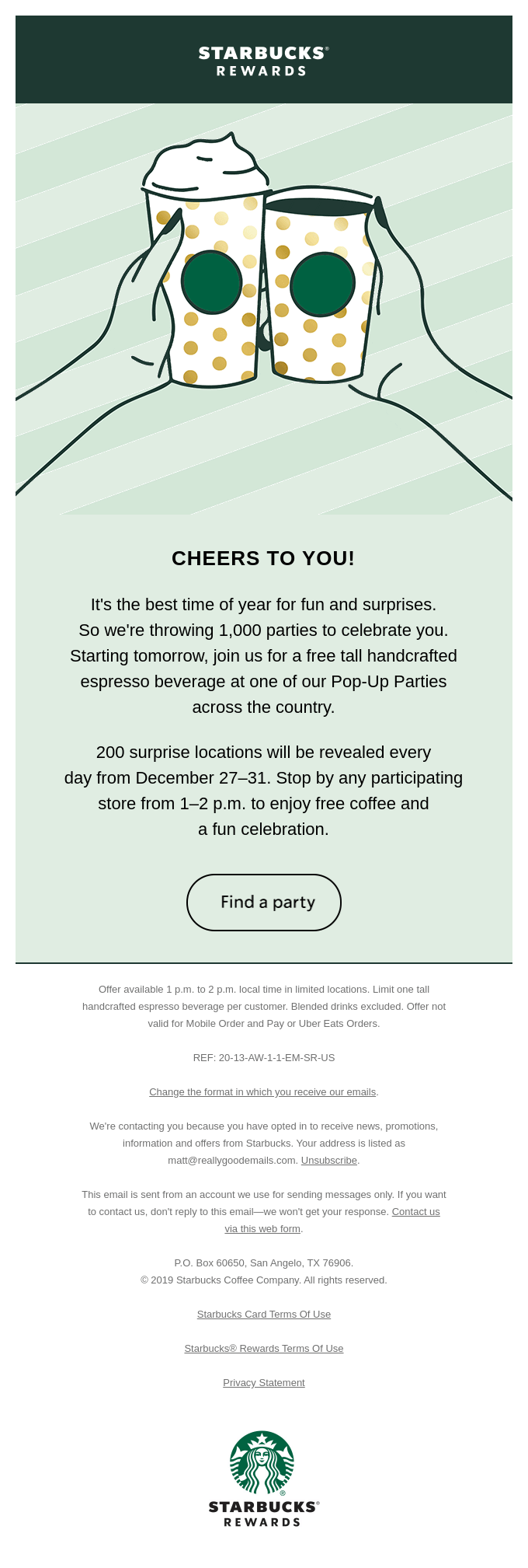
Source: Really Good Emails
Hit the Right Chord
Each and every color has a meaning, characteristic, and emotion attached to it. It is important to choose colors that resonate with your target audience and fit your business needs and message at the same time. Here is a summary of the significance of the most commonly used colors.
- Black: elegance, power, strength, authority, precision
- White: cleanliness, purity, independence, simplicity, peace
- Red: urgency, energy, passion, excitement, romance, boldness
- Blue: trust, reliability, security, calm, strength, dependability
- Green: tranquility, nature, peace, health, growth
- Yellow: joy, happiness, warmth, glory
- Orange: cheerfulness, creativity, confidence, friendliness, entertainment
It is very important to choose the right colors based on the message you are trying to convey and the various moods and visual simulation you are trying to evoke.
Check out this email example from the brand Ritual. Being in the health and wellness domain, it is vital for the brand to invoke a feeling of reliability, strength, and security. It therefore uses the color blue to represent their vision, mission, product details, and CTA. They have also used the color yellow to draw user attention and depict a sense of warmth.

Source: Really Good Emails
Combine Various Color Schemes
The combination of colors used in an email play an important role in enhancing the quality of design. You need to choose the right colors from the color spectrum and use it in a way that makes the email visually appealing and highlights the important parts of the message. To start with, choose a base color, also called the primary color and then select a secondary or tertiary color matching the primary color. The right color theme can set the hierarchy of your message and make your email interesting.
The most common color schemes are:
- Achromatic: White text on black background or black text on white background
- Monochromatic: Different shades of the same color- for example, Sapphire, Navy, Sky and Denim are various shades of blue
- Analogous: Two non-contrasting colors that are slightly different in shades- for example, yellow and orange
- Complementary: Two opposite colors that generate a sharp contrasting effect- for example, green and red
Here’s an email from Peloton that uses various combinations of black, white, and red throughout the email. The brand plays around with these three colors to highlight the important parts of the message, the offers, and the CTA. The use of red for the main header and CTA makes them stand out. Also, the main text is highlighted in white on a black background, which makes it clearly readable.

Source: Really Good Emails
Use Bright Colors for CTAs
The call to action of your email is the main element that drives conversion. It is vital to make your email CTAs prominent and attention-grabbing. Highlight the CTA button using contrasting and bright colors. This will draw the users’ attention and encourage them to click-through.
Check out this email from MailNinja that uses a bright neon green color to highlight the CTA button and the offer.

Source: Really Good Emails
Keep it Simple and Readable
Email marketers often go overboard with colors to make the emails look attractive. No matter what colors you choose or how you make the design look, make sure it is clean and simple. Adding light and high contrast text on dark backgrounds makes the text more readable and gives your email a consistent look.
Wrapping Up
Choose the right colors for your email design and create lasting impressions on your subscribers. Get the basic design and content in place and then add a splash of color to communicate the emotion and give the email design a new dimension of visual intrigue.
Author Bio
Kevin George is Head of Marketing at Email Uplers, one of the fastest growing custom email design and coding companies that specializes in professional email template creation and PSD to HTML email conversion; they are Marketo certified experts. Kevin loves gadgets, bikes, jazz and eats and breathes email marketing. He enjoys sharing his insights and thoughts on email marketing best practices on his blog.


